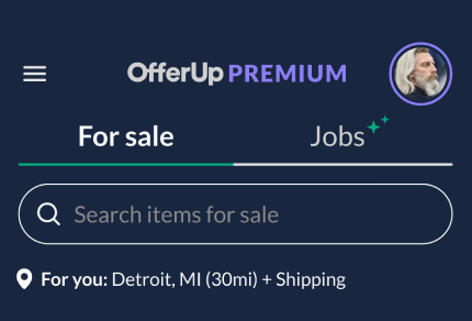
OfferUp Premium
Developing Product Creative with rigorous design experimentation on the OfferUp app
Premium membership is a new fee-based product offering for OfferUp marketplace buyers who want to find and buy a specific item quickly and painlessly.
Premium is an exclusive membership product that removes friction in the shopping process and connects buyers and sellers faster.
Goal Launch, acquire, convert our app users to pay for Premium
Role Design Director
Led all design phases, people & process. E2E customer journey, strategy, concepting, visual design
Manage product marketing and creative process with marketing designers team to establish a seamless Premium experience
Author and champion a content strategy that drove high conversion to exceed revenue expectations, meanwhile creating efficiency

Aggressive Q1 timelines dictated a launch with without branding or styling, so we'd have to build the plane while it was heading down the tarmac.
With tight partnership and in-the-pocket collaboration my PM and I were able to turn this fledgling product into the fastest growing monetization story of the year.
My PM partner ands I led the design team through in-app experimentation strategies while developing a brand look and feel that would stand out in the buyer flows, and celebrate the benefits to users (without causing significant disruption to the general UI experience).

Landing page strategies leverage choice psychology, copy, content, and pricing tests, highlighting value props in the headlines and copy. Reordering val props, entry points, and so on. Constantly nuancing to achieve maximum conversion.
I worked with my PM to schedule experiments to run in every sprint so we could methodically iterate on layout design, copy, brand elements, CTA language and entry-point placement. Then we would map winning entry points to winning landing pages to validate our assumptions. Boom!
Around the end of Q2, I personally conducted a quick refresh of the brand elements tightening up the look and feel in the UI, emails, ads, and with my product partner, introduced "3-day free trial" placements and remapping of entry points to winning landing pages. The results were rewarding.
In August alone we were able to double the number of sign-ups compared to the cumulative number
of sign-ups from the prior 6 months
Month over month the sign-ups continue to increase.
Metrics from StatSig keep us informed of the impact to other experiments so we can avoid any unwanted downstream effects.
Findings from research led us to introduce more value props, which aded to even more sign-ups. Woo hoo!
The team was lean so I rolled up my sleeves to establish a clean look and feel and wrote copy for touchpoints for the design team to follow.
The full results of this case study are proprietary.

Mapping placement of creative assets to test value props that flow to landing / upsell pages
Building the Premium brand


Defined a brand color system that complemented the brand green while standing out in the app, with a color scale that ensures accessibility in light and dark modes. Badges and labels follow the new brand guidelines.
branding and badge in dark mode

branding and badge in light mode
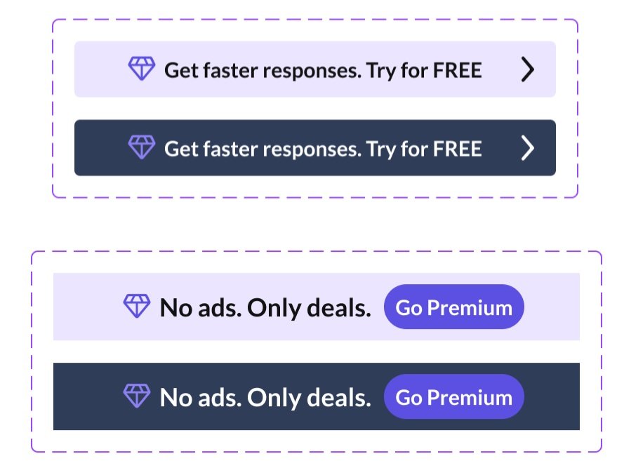
Assets elegantly stand out in the app to encourage engagement

I designed and wrote campaign ads for awareness in the app